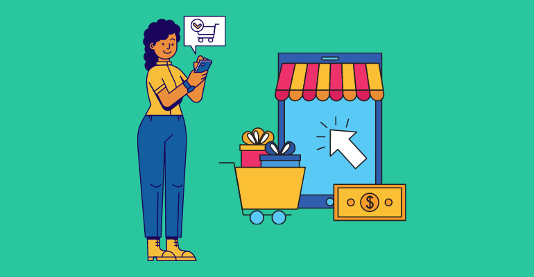
Conversion is a magic word, incredibly important to everyone who has sales pages because business owners today are not overly interested and should not be interested in the number of likes, fans, or visits to the website. They are interested in how many visitors bought the product or service they offer. Every visitor to the site is a potential customer and everything that is written on the site – every page, image, or button – should be for the purpose of turning a visitor into a customer.
Without a conversion, a sales page or e-commerce website is just another ordinary page on the Internet. That is why much of the work in online sales comes down to figuring out ways to better convert, applying the tools by which we intend to achieve that, testing them, and measuring results. Great web design, tailored to e-commerce, perfect product pages, A/B testing (which segments give better effect)… those who sell are constantly working to increase conversions.
In order to progress, and when most of the already known tactics and tricks for better conversion are exploited, sometimes it is worth taking a little risk. Here are some tactics that may seem a little strange at first glance but have been shown to work and increase conversions.
Pop-Up Windows
When you mention a pop-up (or a pop-up window), most people will tell you that it annoys them so much. So, do you want to annoy your visitors, your potential customers? Of course not. Not at all.
But despite the bad reputation, these windows have an effect. They are working. Pop-ups are successful for the same reason that annoys millions of people. They ask you for a reaction, a response of any kind. Some people will probably leave your site for good. But the catch is that many more of them than before will agree to respond. You will make a conversion. The best example of this success is setting up a newsletter subscription window.
- The advice is to make the pop-up big, use the lightbox, and tailor it according to the website and the needs of the visitors.
- Don’t annoy visitors but offer them additional value that will make them bond to your site.
- It is very important that the visitor can close the window easily and without much trouble if they do not want to take any action.
- Also, be careful not to show this window to the same visitor too often, as you may drive them away.
- Make sure the pop-up appears at least a minute after the reader arrives on the page and when he has already scrolled at least 75 % of the page content.
Do Something for Visitors – For Free
We will show how this is done on the example of an American online shoe and clothing retailer Zappos. It has already legendary customer service. It offers free shipping for your orders (which is by no means uncommon), even free postage in case you return the goods. If you sell shoes and clothes, this policy can sound like suicide because, in such situations, up to 30 % of orders are returned.
On the front page of Zappos, as well as on most of its main landing pages, it is pointed out that delivery, as well as return, is free. It recognized the love that customers have for free services and focused its marketing in that direction. Zappos really does a lot of things for free, and from the point of view of business, it is doing quite all right. Giving free stuff – shipping, books, products – attracts consumers and improves conversions.
If you sell products, the most popular move is free shipping. Buyers despise shipping costs, so they always ‘stick’ to free shipping. Offers for free ebooks and white paper documents are also very popular. Typically, these offers are used to increase the list of email subscribers. The organization of various competitions or a temporary free subscription to certain software or products is also highly rated. It is especially important to stand out in a market that is flooded not only with products but also with free items and offers.
How to Make Your Free Offer Bring a Conversion
- Don’t set too high a requirement for someone to qualify for the free offer. Forcing users to fill out forms that are too long can reduce your conversion.
- Don’t let people seem to have to work hard for your reward.
- Promote gifts rather than promotions. Research from a few years ago showed that the word ‘giveaway’ brings 27 % more conversion than the ‘winner’ and even 50 % more than the ‘promotion’. The right, exact words are important.
- If you are giving away a product, show what it looks like – the image of the product you will give away can increase the conversion by up to 22 %. Even if your gift is not an object but, say, free delivery, you can still present it visually.
Make Long Landing Page
Believe it or not, Amazon’s landing page is exactly 4,499 words long! That is very long. Does that mean Amazon is a crazy company? You have probably heard the usual ‘wisdom’ about too long sales pages and a lot of advice about it: to make it short, that you will lose people on long pages, not to let the user have to scroll…
The long pages on the website you built, no matter how appealing and well-designed they visually seem, were said to be ‘ugly’ and serve no purpose. That is why online marketing experts have started to make shorter pages and prayed that conversions will skyrocket. But over time, they have found that long pages are just as effective, if not more useful, than short pages.
Big Companies Showed How Long Pages Work
Long pages are boring, nobody reads that – at least, that is what we were told. However, that is obviously not true. Web-users read the content they are interested in. As long as the content is well written, relevant, and engaging for the reader, people will read it. The page that follows the way and the process of thinking of the reader must be long but, on the other hand, it will convert better.
Crazy Egg created a landing page on its site that was even 20 times longer than the original. This resulted in a conversion improvement of 363 %! And, what about MOZ. Their redesign of the landing page made the landing page 6 times longer than the original. No matter how strange it seemed – it worked! Its conversion grew by more than 50 %, resulting in $ 1 million more revenue!
Conclusion
If you are really serious about selling online, of course, you should apply the tips recommended by successful ones as well as those who specialize in conversion issues. But don’t blindly listen to all the advice and don’t just follow the trends, which sometimes change too often.
Try what works best for your business and experiment. Because, sometimes, even ideas that seem ‘goofy’ at first glance, give phenomenal results. Like, for example, pop-ups, which irritate us all. But they work.